Tag Archives: mapping

building research

Back at it again: Tinkering with Maps

I played with Google Map API v.3 in OpenLayers today with the mission to fix a couple things broken on my Myspace Friendship Web Map. All of this is inspired by my recent revisit of my spatial (ethno)musicology at my UCLA talk on digital ethnography and the NCCSEM roundtable on alternative careers for ethnomusicology PhDs at Santa Clara University this past weekend. I also want to make some new visualizations for my talk at the upcoming EMP/IASMP meeting in New York in a couple of weeks.

More significantly, I’ve been preoccupied with how I can build on my music-map project. With the goal to develop tools to visualize the relationship between music and space, I want to go a step further than visualizing socio-musical communities to find a way to visualize the spatial patterns in the sound and lyrics of songs. This constellation of impulses and mini codling practices will contribute to my eventually goal of building a site, web hub for music scholars to rethink how the digital would enhance the spatial understanding of music and music-cultures.

I set aside a large chunk of time today to read and code today. I read Julie Meloni’s webcraft book to learn the syntax of JavaScript so that I could decipher the OpenLayers script that Joe and I worked on at the Scholars’ Lab. I read about DOM and reviewed some introduction to the basic structure, objects, and syntax of JavaScript. I also found out the some time early last year, Google came out with a Google Map API version 3. They are in the process of phasing out, or to use their language, “deprecating” version 2. So I set out to learn how to make the Google Map API version 3 work with the OpenLayers script that I came up with, while working with Joe (Gilbert) at the Scholars’ Lab.

I read the source code of the OpenLayers Google Map V.3 example and inserted parts of it into my original OL script. By the end of the day, I was able to get V3 to work in a new version [Kominasmap5.html]. In this version, Google Map layers download properly with the Spherical-Mercator projection. The loading time for the GM layers is much faster than better. The block-by-block layer download is replaced by a much faster download of the entire map. But the WMS layers (such as world_regions and muslim_majority) that the Scholars Lab created, however, are currently malfunctioning at this point. I took those parts of the script [var Layers] out to avoid brokenness.

I also learned how to center the map on specific lat-long coordinates. I decided to center the map with Singapore (103.8, 1.3667). I figured this way I can concentrate the friendship patterns in Asia, in particular South and Southeast Asia.

Here is the snippet of code that’s related to centering and projection:

new OpenLayers.Projection("EPSG:4326"),
map.getProjectionObject()
), 5);

I have no idea why “EPSG:4326″ is used in the OpenLayers Google Map v.3 example. This is especially puzzling when it explains in its comments that “Google.v3 uses EPSG:900913 as projection, so we have to // transform our coordinates.” In order to solve this puzzle, I may need to read about how projection works in OpenLayers.

In addition, the zoom is still broken (as it is in the previous version–kominasmap3–the public one hosted on beingwendyhsu.info) in the new version. The map can’t be zoomed all the out to the inter-continental level as before. I was not able to fix this in this iteration. A perhaps related problem is that the zoom bar on the left side of the map panel disappeared in this version.

I’m happy to be back at hacking, coding, and building again. It makes me feel incredibly productive. It feeds my inner child who loves to learn new things and imagine possibilities.

Goals for the next round:
– place a continent layer back into the map
– insert a zoom bar
– read parts of Julie M’s book on variables, functions, etc (ch 16 + 17)

Some OpenLayers zoom examples:
http://openlayers.org/dev/examples/fractional-zoom.html
http://openlayers.org/dev/examples/zoom.html
http://openlayers.org/dev/examples/fractional-zoom.html

research

Mapping an Asian American Indie Rock Digital Diaspora

My dissertation project investigates the musical and social life of current independent rock musicians of Asian descent. This research looks at the music, interviews, and social interactions of these musicians. How do I do this?

Prior to working with UVa’s Scholars Lab, my method of field research had been participant observation: attending concerts, doing formal and informal interviews, interacting with the musicians’ friends and fans, listening to their recorded music, organizing local performances on their tours…an immersion in these musicians’ multi-faceted musical life. As soon as I began my field research, I discovered that the notion of “the field” has changed because of the prevalent usage of digital social media among the musicians of my study. The Internet, is no longer just a means of communication between me and my informants. Digital social media make up an important site of social interactions and creative expressions. Not only that, it is the key to social networking and community building for these musicians. Thus the “field” of my investigation came to include the digital social terrain that I navigate within the scope of dissertation research.

This post focuses on the map of one of the bands that I study: The Kominas. The Kominas is a South Asian American punk band that spawned in Boston, now based in Philadelphia. Recombining sounds from the Boston ska-and-crust-punk scene with 1970s Bollywood movies and Bhangra music from their parents’ dusty tape collection, The Kominas evokes a radically transnational sonic landscape. [Example “Par Desi”] Since 2006, the band has been vigorously creating a translocal social terrain via face-to-face interactions through touring and online social networking. The Kominas’ do-it-yourself network is comprised of Muslim-, South-Asian-identified, and other taqwacore-inspired musicians, listeners, artists, filmmakers, and bloggers.

In this post, I ask:  What does The Kominas’ “digital diaspora” look like geographically and spatially? First, I will describe the digital methods I used to map this community.

Digital Methods – Web-scraping and Visualization

To create such a map, I designed and executed out a two-phase method. Phase 1 is web-scraping, the process of mining data from the Internet. This process entails first, locating a source of useful geographic data, and then harvesting this information programmatically. I was interested in two sets of data, specifically: the physical location of the band’s performance tours; and the self-reported (physical) location of the friends in an online community. The first set of data, regarding performance locations, was found on The Kominas’ official website. The information regarding friend locations was found in its most complete form on the social networking site Myspace.

To extract and process these data sets, with the help of Joe Gilbert, I wrote a program using Ruby to parse out the relevant information in the source code of the profile pages of The Kominas’ Myspace friends. The Kominas [as of April 2010] had close to 3,000 friends on Myspace. These are all Myspace users who have requested to become friends with The Kominas, or vice versa. Using Mechanize, a Ruby gem, the program extracted all the geographically related text from the Myspace profile pages of 2,867 friends. Using the Geokit, a ruby gem that implements the Google Geocoder, the program translated this information into a set of spatial coordinates, specifically, latitude and longitude.

Phase 2 – geospatial visualization – is the process of turning the harvested data into a meaningful visualization. Using OpenLayers, an open-source mapping program, I created a dynamic map containing all the points of the physical locations of the band’s Myspace friends and performance tours. To contextualize the reading of the physical points, I added various map layers. For example, I added a Google street map layer to label the visualization with the proper name of countries and cities. The rest of my efforts were spent to refine the map, to make it readable and meaningful.

The Kominas’ Digital Diaspora Map: GO!

To interact with the map, click on the above image. This screenshot shows the global distribution of The Kominas’ Myspace friends. The reddish pink clusters represent the friend density in the respective locales. The size of the cluster is an approximate representation of the number of friends in one location.

A baselayer of the world’s regions – marked by various shades of green in the background – helps contextualize the friend distribution across continental boundaries. At a macro level, this map articulates a radically transnational and inter-continental distribution of friends. Areas of high friend density include: North America, Europe, and Asia. The story of translocality becomes more complex as we zoom in on the map to get more geographic detail. In my dissertation, combining maps, music analysis, and interviews, I examine how the members of The Kominas position themselves geographically and ethnically vis a vis this vastly transnational world.

Questions and Concerns

These maps tell a story, a particular kind of story that situates a humanist study of a music-culture within a particular geographic context. In the context of my dissertation, these maps add a spatial texture to the understanding of the translocal social terrain of a U.S.-based musicians of Asian descent. And the visualization process helps me to analyze the musicians’ questioning of their sense of ethnic and national belonging and to situate the ethnographic details of my 24-month field research within a global context.

Here are some more general questions and concerns that I’ve encountered in creating and using these dynamic maps. To express density using a clustering pattern, I used an algorithm that balances point density and readability, so that the contrast between the smallest and the largest clusters is adjusted. In this case, a single-point cluster can be seen and the largest concentration of the friends of the northeast of the United States doesn’t dominate the entire map. This presents the question, am I interested in representing the mathematical reality of this friend community? Or is there some part of the story that I was more interested in telling? Which level of detail is most useful?

I’ve discovered that these maps do not provide any answers to my research questions. They, in fact, present an interpreted reality that generate further useful questions. A map is certainly not a dissertation chapter; but it provides a spatial and geographical context for the musical and social experiences of the musicians in my study.

How I use these maps, of course, depends on the narrative that I want to tell. At a very macro, global level, zoomed all the way out, these maps can look very similar across bands: with large clusters in the North American region, some clustering in Europe, and some but less in other regions of the world. NOT SO INTERESTING…

Of interest to me, in my dissertation, are the patterns of the band’s transnational connections to musicians and fans in Asia. What is the band’s friend distribution in Asia? Is it useful to compare the Asia-based friend distribution across band? I have shown two screenshots of two bands’ friend distribution in Asia. On the top is The Kominas. On the bottom is Kite Operations, a New-York-based noise rock band.

This comparison presents interesting results: These two maps show that The Kominas, a South Asian American punk band has created a social geography much more concentrated in South and Southeast Asia; whereas Kite Operations, with 3/4 of the members being of Korean descent, has stronger friend presence in East Asia, specifically in South Korea. The difference in friend distribution shown by these images can provide a sketch for illustrating a different “Asia” as created through the cultural practice of “friending” on Myspace by American artists of Asian descent.

Combining Digital Methods with “Conventional Methods”

These digital methods seem to have an orthogonal relation to more conventional ethnographic methods. Until these new digital methods become accepted in ethnomusicology and cultural anthropology, I must find a way to integrate the new with the old. [Yes, I have thought-experimented with a set of digitally engaged ethnographic methods.] Here are some ideas for this integration:

  • Showing the map to the musician-informants: Asking them if they are surprised by the results of my study. Asking them questions about how they feel about these places in the world? Personal or musical connections to these places?
  • Toward a Geospatial Music Analysis: Many musicians that I study are pre-occupied with geography. In their lyrics, they often discuss being trapped or living in a limbo between two worlds. They talk about their feelings regarding certain meaningful place and space in their music. It’d be potentially fruitful to juxtapose the musical and social geographies of a single band.
  • Mapping genre/sonic differences: Here I suggest the possibility of incorporating sonic qualities such as tempo, timbre, volume, studio effects, and language/dialect into geospatial information technology and system. Such a tool would be immensely powerful for the study of the world’s music-cultures at the local and global level. For example, the World Musical Map project by Ozan Aksoy based at the New Media Lab at the Graduate Center of CUNY explores the rupture between audio boundaries and actual national borders. Another example is Lee Byron’s visualization of the listening history on Last.FM.

Here’s my attempt to start a digital (ethno)musicology. Are there any other takers?

The Kominas’ Digital Diaspora Map: It’s Your Turn. GO!

Tips:

  • Double-click to zoom in on the map
  • Upper-left: turn on/off various layers: Google Street/Satellite; world’s regions; Muslim-majority countries; clusters (friend density); friends (individual points); gigs.
  • Scroll on the map by clicking + holding + moving the cursor
research

Mapping the Digital Diaspora of a Dissertation Research Blog

At the onset of my field research in summer 2007, I launched a blog – YellowBuzz.org – with the intention to: 1) archive and organize my field notes in textual and audio-visual form; 2) convey my research purpose and progress to informant musicians and the public; 3) self-position as a “participant” in the scene. Since then, I have made over 160 posts, some directly linked and others tangentially related to my research findings about the activities and media of Asian American indie rock musicians. Over the past one and a half years, my field research blog has received attention from both print and online media. Evidently, this blog has constructed a community consisting of musician- and music-enthusiast-visitors with an interest in Asian American and transpacific music-culture.

This past January, I began tracking the blog traffic by using Google Analytics. This service monitors the physical location of site visitors and their interactions with the pages on the site. The geographical data are analyzed in terms of the number of visits per unit of geographical organization such as city, country/territory, sub continent region, and continent. This information is also visualized in the form of an interactive map on which users can zoom in and out of specific locales and find site visit patterns specific to cities, countries, regions, or continents in the world.

Over the last four months, I have been playing with the May Overlay function projecting geospatial patterns of the site traffic on my blog. These interactive moments have helped me imagine interesting questions such as: What is the geography of an electronic community based on the topic of “Asian American music,” the tagline of my blog? What does the geo-spatial terrain of this “digital diaspora” look like? Are there any striking patterns at each of the organizational level namely, the city, country, sub-continental region, and continent? What spatial boundaries are transcended and created in these visualizations? Or, fancifully, how does the digital geography of my blog reconfigure the more general social geography of “Asian America” online or offline?

Today marks a 4-month anniversary of this thought experiment. I decided to take some screen shots of a few of the visualizations that I’ve found more meaningful in Google Analytics. This analysis uses data from a sample of 3,061 site visits collected from January 1 to April 30, 2009. I will highlight a few interesting findings below:

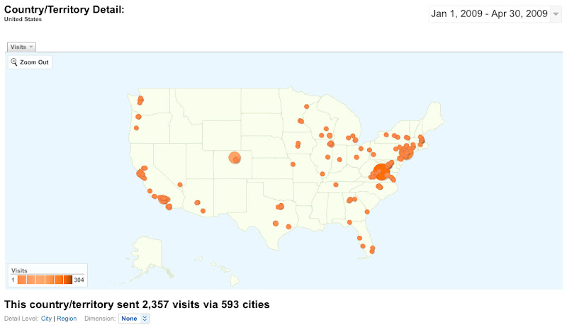
1) Here’s a map of blog visits in various U.S. cities. It appears that the visitors are concentrated in central Virginia (the home of yours truly), New York City, Boulder, Los Angeles, and San Francisco. Other than central Virginia and Boulder, these are areas of high concentration of Asian Americans and indie rock activities. I’m not quite sure how to explain the traffic flow from the Denver area (Boulder and Aurora, ranked third and sixth in this map, respectively) other than to link it to the thriving indie rock scene in Boulder and the physical location of an Asian/Japanese music blogger Shay of Sparkplugged.

blog visits in U.S. cities

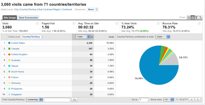
2) According to this chart, 76% of the site visits have occurred within the boundaries of the United States. Next on the list are Canada, United Kingdom, and Australia, all English-speaking countries with close historical ties to American music. In the continent of Asia, countries such as Taiwan, South Korea, the Philippines, and Singapore have among the highest number of visitors to my site. I attribute this pattern to my blog posts about U.S.-based artists who have a large following in these particular countries. Specifically, Hsu-nami (of New Jersey) and Johnny Hi-Fi (SF-based) has strong ties to Taiwan; Kite Operations (New-York) to South Korea; Plus/Minus (New York) to the Philippines and Taiwan.

site visits per country

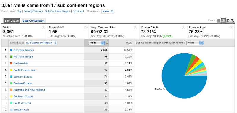
3) This last chart represents the sub-continental spread of the site visits. North America takes the lead (taking 80% of all visits). Northern Europe and Eastern Asia tie as second, followed by South-Eastern Asian and Western Europe. I’m not quite sure how to explain the high number of visits from Northern Europe other than to link it to the popularity of a Taiwanese metal band Chthonic in North Europe. Chthonic has a strong international presence, having worked with producers in Denmark and the U.S. including Rob Caggiano, the guitarist of Anthrax. In 2007, Chthonic toured with the OzzFest and established close ties with Taiwanese-American-led erhu rock group Hsu-nami.

site visits per sub-continent region

So what does this all mean? YellowBuzz, a blog on “Asian American music”, has constructed a global, transnational readership. Asian America in the online digital environment exists beyond the boundaries of the United States and the Asian continent. These observations of transnational crossings work against the geography of Orientalism: a now-classical postcolonial theory referring to the representational control of the non-west by western-produced discourse. The transnational digital diaspora of YellowBuzz has tampered with the so-called east-west binary.

Now if I were serious about pursuing the research on the transnationality of Internet music journalism, I would look for a correlation between blog content and traffic patterns. This would require systematic, post-to-post observations. I would also consider mapping information regarding Internet access and user demographic with the intention to find links between the blog statistics and general Internet sociality. I would also look for statistical and mapping methods more powerful than Google Analytics.

But – to get back to my dissertation that asks: What paths do musicians and their music take as they establish routes crossing territories constructed by nation-states, corporations, international laws, etc? Unfortunately, these visualizations lack the analytical strength to provide an insight on the musicians’ perspective on the scene. They have offered a perspective on media, in particular in understanding the role of a music blog in constructing “Asian America.”

In the coming months, I will be working on a digital humanities project with Joe Gilbert at UVa’s Scholars’ Lab pursuing questions related to the musicians’ side of the story. I hope to unravel the terrain of musicians’ sociality within the transnational scene of indie rock music by mapping out their tours, social networks on (SNS), and record distribution. Meanwhile, I’m experiencing a bout of euphoria loving the fact that I have reclaimed a free market analytical tool offered by Google for my academic(-y) ethnomusicological thought experiment.

————————————————————————————-

This post was originally posted on May 4, 2009 on the UVa Scholars’ Lab Blog and my field research blog Yellowbuzz.